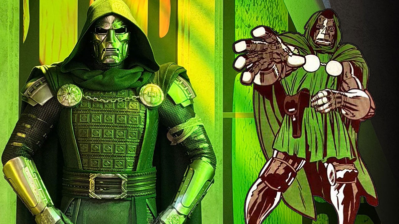
Now that we’ve seen our first look at Robert Downey, Jr’s Doctor Doom in action in the recent trailer , we know that Marvel is sticking fairly close to the source material for Victor von Doom’s outfit. The Fantastic Four and Avengers nemesis has one of the most iconic supervillain costumes in all of superhero fiction, so it’d be a mistake to reinvent the wheel here. Thankfully, the metal mask, green hood, and flowing cape gives the MCU’s Doom a regal attire worthy of Jack Kirby’s original design for the character. Now that we have images of the costume on display at SDCC, let’s take a closer look at how Doctor Doom’s MCU costume compares to the comics. VICTOR VON DOOM IN ALL HIS GLORY. The Man in the Iron Mask If there’s one aspect of Doctor Doom’s look that simply must be preserved, it’s his signature iron mask. Not only is it his most recognizable visual trait, it’s a critical part of his character. Victor von Doom is one of the most arrogant and egotistical men on the planet, and the damage he incurred to his face because of a botched experiment in college that he blames Reed Richards for is the origin point for their rivalry. How damaged Doom’s face actually is varies by interpretation (Jack Kirby famously believed that Doom only had a small scar), but any imperfection is too much for Doom, who hides his visage behind the metal mask. FACE TO FACE. As we can see from this comparison between the source material and the MCU costume, Marvel has replicated the design from the comics pretty closely. The shape and texture work is excellent, and the look of the nose and mouth areas hearken back to classic images of Doom from the source material. Also preserved is the green hood over the top of his mask, which is another one of his signature flourishes. An early look at Doom’s costume from the Disney Marketing Expo in Shanghai appeared darker and more washed out, but thankfully that seems to have been the lighting, with the costume on display making it clear that the hood is green. Stickler for Details Doom’s comic costume is elegant in its simplicity, but the MCU version has its own take on many of the details. Typically, Doom’s chest area is just covered by a green tunic connected to the hood, laid over his armor and fastened with a brown belt with gold buckle. Those aspects are maintained but with some color variation (looks like a black belt with silver buckle in the film), but the bigger change to the chest area is the addition of what seems to be a samurai-inspired chest plate. I’m not certain if this was a direct inspiration, but it reminds me of the upgraded armor Doom wore in the 1984 Secret Wars comic after he stole the Beyonder’s power (pictured on the far right above). We also want to point out the gold rondels affixed near the shoulders, which while typically just flat circles in the comics, here have some additional patterning that may be important. The symbols could be mystic runes, which would make sense given that Doom’s mother was a witch and he possesses magic powers in the comics. We see similar runes on Doom’s gloves, which also have a key difference from the comics. The actual hand portion of the glove in the film version is made of leather instead of full metal gauntlets, which makes sense to let RDJ or his stunt doubles actually grab objects comfortably. There’s also a matching adjustment to the legs, where we see dark green pants on Doom’s upper legs, and the metal portions of his boots only start around the knee area. Again, this change was likely made to make the costume easier to wear on set, since a full metal bodysuit isn’t entirely practical. Still, the overall look feels like classic Doom even with these changes. How Does the MCU Doom’s Costume Compare to Fox’s Versions? Looking at the costume on display, it’s clear that Marvel Studios has learned some lessons from 20th Century Fox’s interpretations of Doctor Doom. While the late Julian McMahon’s costumes weren’t terrible, and they did get the mask right, the overall look in the first Tim Story film ultimately felt a bit cheap since he had business wear instead of armor, and the costume in Rise of the Silver Surfer was basically all black instead of green. Worse, the design from the 2015 reboot left poor Toby Kebbell saddled with one of the worst supervillain looks in all of comic book movies: an astronaut suit warped by green energy and grey sludge, making him look like a possessed crash-test dummy. It’s nowhere near what anyone wanted out of the lord of Latveria on the big screen. DOOM HAS SEEN BETTER DAYS... It's a shame that most cosplay from fans has so far been better than Hollywood's takes on Doom before now, but we're finally seeing this rectified by the MCU. We can’t say how Doomsday will depict Doom’s personality yet, but at least in terms of visuals, Marvel Studios is on the right track. We’ll see how RDJ’s Doom fares when Avengers: Doomsday arrives in theaters in December. Carlos Morales writes novels, articles, and Mass Effect essays. You can follow his fixations on Twitter . In This Article Avengers: Doomsday Marvel Studios Initial Release: Dec 18, 2026 Not yet available for streaming. Comments
As an Amazon Associate we earn from qualifying purchases. Some links on this page are affiliate
links — if you click through and make a purchase, we may earn a commission at no extra cost to
you.





Comments (0)
Loading comments…